Samples of previous work
All ProjectsThe Active Channel
Developing our concept and vision for the project
After gathering research from the Active Channel’s team on their iOS app, we started with sketching our basic concepts for what it could look like on Android.
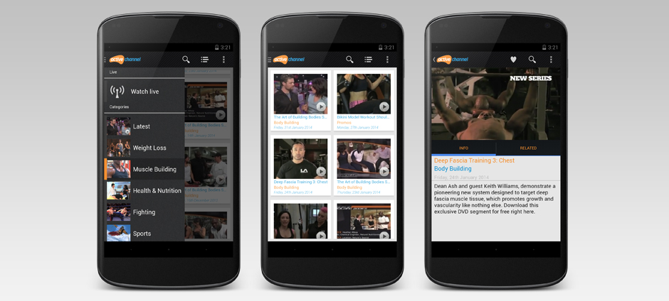
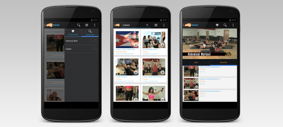
We sketched out a number of UX/UI iterations for both mobile and tablet, though mobile led tablet on the project at this stage. The key here was to marry the Google Holo experience with the uniqueness of the Active Channel’s brand and style.
The Challenge
The UX and design phase followed a strict iterative process with demonstrable development spikes. We created various prototypes and applies different techniques for laying out the show “cards”. This was important as it fundamentally differed from iOS and was important to share with the team.
Our Process
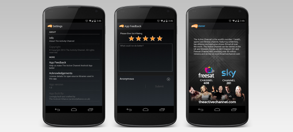
Both Active Channel and Android’s Holo UI have their own distinct visual styles. Combining these transformed our wireframes into an application that conveyed both of these brands into one unique experience.
Fragmentation – not a problem!
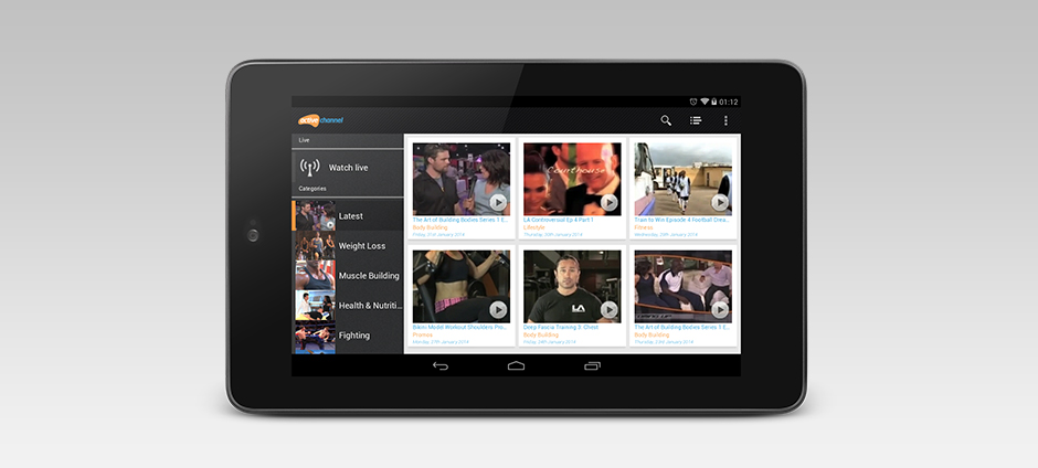
We designed the Active Channel app to work elegantly from small mobile devices up to large tablets using Android’s Fragments architecture. This allowed us to create a an application that could easily adapt to many screen sizes and device types whilst maintaining a sense of consistency in features, user experience and look.
Technology
- Android application
- Information Architecture
- User Interface Design
- Programming


