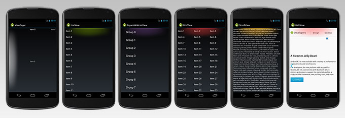
Theming the Android Scroll Edge Effect
With the introduction of Android 3.0 Honeycomb came a new design language, a new look for the Android platform known as Holo. With Android 4.0 Ice Cream Sandwich, it became a requirement for manufacturers to include an unmodified version of the Holo theme on their device.
Before Ice Cream Sandwich the variance in system themes from device to device could make it difficult to design an app with a single predictable look and feel.
The idea for Holo was to bring a consistent design to the Android platform and its applications.
The platform was missing a recognisable identity and its own specific design language, and with Holo the platform had a new direction. Although, this was great for the platform, it went a little far in its application, applying a strong blue accent colour to many aspects of the UI. This could create a clash with the branding and colouring of our apps and their personality. Fortunately, the platform was designed with designers and developers in mind, where we could theme elements like the button focus and pressed states, text field and list scrollbars. However, some elements could not be reached with simply creating a theme. An important component, the ScrollView and related elements like ListView, ViewPager, WebView still displayed that strong blue glow when the top or bottom of the content had been reached.
Following Android design patterns doesn’t mean that your app has to look the same as everyone else’s
For a long time developers either turned the feature off completely – removing any indication of that the bottom of the content had been reached or had to challenge our designers with creating designs that would work with the blue glow being displayed.
One advantage of the Android platform over other platforms is the fact that the it is Open Source. This means that the code running on our devices is available for everyone to read, and our team of developers did exactly that. With an understanding of how the platform applied the graphical assets used for the over scroll glow, they managed to create a library of components where the glow could be of any colour we chose. The first application to be graced with this look was the Gresham College application, featuring a nice red hue on the over scroll glow and it wasn’t long before other developers noticed the effect.
The Android platform has a strong community of developers, and has a very healthy portfolio of Open Source libraries. As the interest in how the “over scroll effect” was applied kept being asked it was an obvious choice that we should make the library available to everybody.
With this the Edge Effect Override library was uploaded to GitHub. All designers and developers could finally design their applications with their colour schemes complete. More neutral and complimentary glows could be used, allowing applications stand out and show their own personalities through colouring and branding. Rather than the Holo-blue, we could now apply brand accent colours and apply the right visual balance between brand and the Holo design language.
Within a short space of time, the library was embraced by the developer community and “pull requests” were being sent thick and fast. Soon the library started to span many more of the scroll components and a method of applying dynamic colours was introduced giving designers more possibilities to use colour. The pace at which the library grew was a thoroughly interesting experience.
So if you are an Android developer, creating your first application or your latest, download the library and apply it to your project and let the personality of your application shine as an extension of your brand.
You can download or fork the Edge Effect Override library here:
